


はじめに
この記事では、MaterialApp の theme プロパティを使用して、アプリ全体のテーマをカスタマイズする方法を解説します。
ダークモードの対応は考えていません。
開発環境は下記のとおりです。
- Windows11 24H2
- Flutter 3.24.5
- Android Studio 2024.2
- Visual Studio 17.12.5
サンプルアプリの作成
MaterialApp の theme プロパティに任意の ThemeData を設定することで、デフォルトのテーマカラー(背景色や AppBar などの主要部分の色)を変更できます。
サンプルアプリを作りながらデフォルトのテーマカラーの変更方法を見ていきます。
import 'package:flutter/material.dart';
/// アプリケーションのエントリーポイント
void main() {
runApp(const MyApp());
}
/// アプリケーションのルートウィジェット
///
/// アプリケーションの全体的なテーマや設定を定義します。
class MyApp extends StatelessWidget {
const MyApp({super.key});
Widget build(BuildContext context) {
return MaterialApp(
title: 'ThemeData Demo',
theme: ThemeData(
colorScheme: ColorScheme.fromSeed(seedColor: Colors.deepPurple),
useMaterial3: true,
),
home: const MyHomePage(title: 'ThemeData Demo Home Page'),
);
}
}
/// ホーム画面のウィジェット
///
/// テキスト入力ダイアログを表示し、入力されたテキストを画面に表示する
/// StatefulWidgetです。
class MyHomePage extends StatefulWidget {
const MyHomePage({super.key, required this.title});
/// アプリバーに表示されるタイトル
final String title;
State<MyHomePage> createState() => _MyHomePageState();
}
/// MyHomePageの状態を管理するStateクラス
class _MyHomePageState extends State<MyHomePage> {
/// 画面に表示されるテキスト
///
/// ダイアログで入力されたテキストがここに保存される
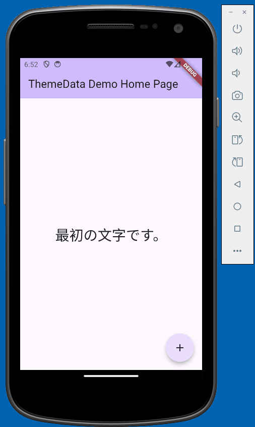
String _inputText = "最初の文字です。";
/// テキスト入力フィールドのコントローラー
final TextEditingController _textController = TextEditingController();
/// テキスト入力ダイアログを表示するメソッド
///
/// OKボタンが押された場合、入力されたテキストが画面に反映される
void _showTextFieldDialog() async {
final result = await showDialog<bool>(
context: context,
builder: (context) => AlertDialog(
title: const Text('確認'),
content: TextField(
controller: _textController,
decoration: const InputDecoration(
labelText: 'メモを入力してください',
),
),
actions: [
TextButton(
onPressed: () => Navigator.pop(context, false), // キャンセルボタン:false を返す
child: const Text('キャンセル'),
),
ElevatedButton(
onPressed: () => Navigator.pop(context, true), // OKボタン:true を返す
child: const Text('OK'),
)
],
),
);
// nullチェックと非同期処理時のcontext.mountedのチェック
if ((result ?? false) && context.mounted) {
setState(() {
_inputText = _textController.text;
_textController.clear();
});
}
}
Widget build(BuildContext context) {
return Scaffold(
appBar: AppBar(
backgroundColor: Theme.of(context).colorScheme.inversePrimary,
title: Text(widget.title),
),
body: Center(
child: Column(
mainAxisAlignment: MainAxisAlignment.center,
children: <Widget>[
Text(
_inputText,
style: Theme.of(context).textTheme.headlineMedium,
),
],
),
),
floatingActionButton: FloatingActionButton(
onPressed: _showTextFieldDialog,
tooltip: 'showTextFieldDialog',
shape: const CircleBorder(),
child: const Icon(Icons.add),
),
);
}
}ここまで実装した状態で一旦起動してみます。
ThemeData の設定
colorSchemeで指定されている色を変更することで、Flutter 側でアプリ全体の配色をいい感じにしてくれます。
試しにColors.redをに変更してみます。
// 省略

theme: ThemeData(
- colorScheme: ColorScheme.fromSeed(seedColor: Colors.deepPurple),
+ colorScheme: ColorScheme.fromSeed(seedColor: Colors.red),
  useMaterial3: true,
),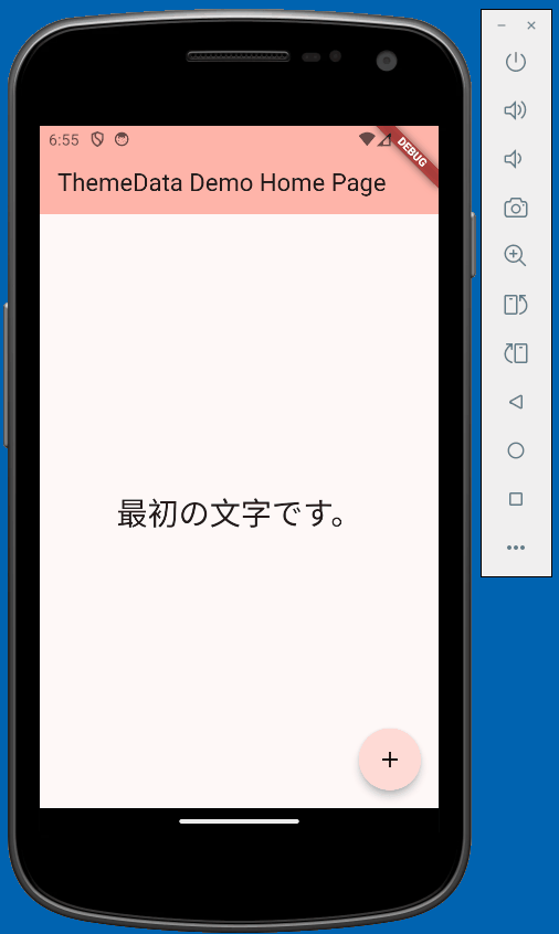
原色を指定しましたが、いい感じに配色されていま�す。
しかし「背景を白色で統一したい」とか「テキストフィールドは自動で配色されたくない」などカスタマイズしたい場面も出てくると思います。
次は Widget 単位でデフォルトのテーマカラーを指定する方法を見ていきます。
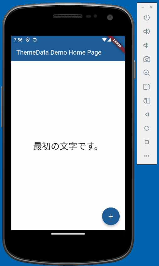
buildメソッド内のMyAppクラスを以下の用に修正します。
class MyApp extends StatelessWidget {
+ final Color appBaseColor = const Color(0xFF1D5C96);
+ final Color appBaseTitle = const Color(0xFFFFFFFF);
+ final Color baseBackgroundColor = const Color(0xFFFFFFFF);
const MyApp({super.key});
Widget build(BuildContext context) {
return MaterialApp(
title: 'ThemeData Demo',
theme: ThemeData(
- colorScheme: ColorScheme.fromSeed(seedColor: Colors.deepPurple),
useMaterial3: true,
+ // AppBarの背景色とテキストの色、サイズなど
+ appBarTheme: AppBarTheme(
+ backgroundColor: appBaseColor,
+ foregroundColor: appBaseTitle,
+ titleTextStyle: TextStyle(
+ color: appBaseTitle,
+ fontSize: 20,
+ fontWeight: FontWeight.w400,
+ ),
+ ),
+ // 背景を白色
+ scaffoldBackgroundColor: baseBackgroundColor,
+ // ダイアログ
+ dialogTheme: DialogTheme(
+ // ダイアログボックス全体の背景色を指定
+ backgroundColor: baseBackgroundColor,
+ // ダイアログの形状を定義
+ shape: RoundedRectangleBorder(
+ // 角の丸みを無くす
+ borderRadius: BorderRadius.circular(0.0),
+ ),
+ ),
+ // テキストボタン
+ textButtonTheme: TextButtonThemeData(
+ // デフォルトの色を指定
+ style: TextButton.styleFrom(foregroundColor: Colors.black),
+ ),
+ // floatingActionButton
+ floatingActionButtonTheme: FloatingActionButtonThemeData(
+ backgroundColor: appBaseColor,
+ foregroundColor: baseBackgroundColor,
+ shape: const CircleBorder(),
+ ),
+ // ボタンのテーマ
+ elevatedButtonTheme: ElevatedButtonThemeData(
+ style: ElevatedButton.styleFrom(
+ backgroundColor: appBaseColor,
+ foregroundColor: Colors.white,
+ ),
+ ),
+ // カーソル関連の設定
+ textSelectionTheme: TextSelectionThemeData(
+ cursorColor: appBaseColor, // カーソルの色
+ selectionColor: appBaseColor.withOpacity(0.3), // テキスト選択時の背景色
+ selectionHandleColor: appBaseColor, // 選択ハンドルの色
+ ),
+ // TextFieldなどでonFocusの時の枠線のstyle
+ inputDecorationTheme: InputDecorationTheme(
+ // 通常時の下線
+ enabledBorder: const UnderlineInputBorder(
+ borderSide: BorderSide(
+ color: Colors.black,
+ width: 1.0,
+ ),
+ ),
+ // フォーカス時の下線
+ focusedBorder: UnderlineInputBorder(
+ borderSide: BorderSide(
+ color: appBaseColor,
+ width: 2.0,
+ ),
+ ),
+ // フォーカス時のラベルの色
+ floatingLabelStyle: TextStyle(color: appBaseColor),
),
),
home: const MyHomePage(title: 'ThemeData Demo Home Page'),
);
}
// 省略
Widget build(BuildContext context) {
return Scaffold(
appBar: AppBar(
- backgroundColor: Theme.of(context).colorScheme.inversePrimary,
title: Text(widget.title),
),
// 省略
);
}
}Dart で RGB 値を使用する場合は以下のように指定する必要があります。
0x:16 進数リテラルを表すプレフィックスFF:透明度(不透明、00だと完全透明)FFFFFF:RBG 値(白色)
Understanding Flutter Colors: A Guide to Color Models in Flutter
コメントの記述通り、ダイアログの背景やデフォルトの形状、TextField のカーソルやフォーカスやテキスト選択時の配色などを変更しています。
おわりに
この記事では、Flutter アプリのテーマカスタマイズについて以下の 2 つのアプローチを解説しました。
colorSchemeを使用した簡単なテーマ変更- Widget 単位での詳細なカスタマイズ
特に、TextField やダイアログなどよく使用される Widget のカスタマイズ方法を紹介しました。
より詳しい情報はFlutter 公式ドキュメントを参照してください。
今回作成したアプリのコードはGitHub で公開しています。